Hey guys,
Currently experimenting with a more tablet-friendly UI direction. My goal is to make our product easy to use on desktop and tablets. The user should be able to achieve the same actions in both seamlessly.
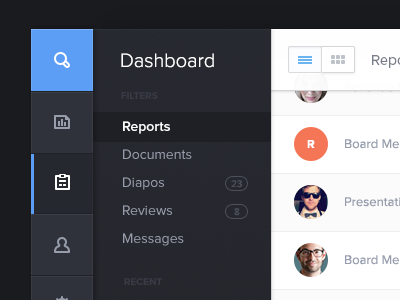
So to explain a bit, the left menu with the icons is the main one. Each tab goes to each main section of the app. When you select a tab, the submenu on the right appears with the title of the section and a sub navigation. The white part is the content of the screen based on what you selected on the left.
Also, what you see is 'dummy' content I added to avoid revealing too much.
I'm so frustrated with not being able to show a bigger picture, I've so many screens and UI elements to share. Can't wait for our product to be out!
Like always feel free to share your thoughts!